For making a good website design there are many different ways to make it more accessible and beautiful with different User interface techniques. These techniques are usually applied in a period of time and its a long process to be in full effect.
Hover controls is one the most easiest way, we can make an web application or website to look simply elegant. Roles of hover controls can be many but the basic ways its being used now-a-days is very intuitive.
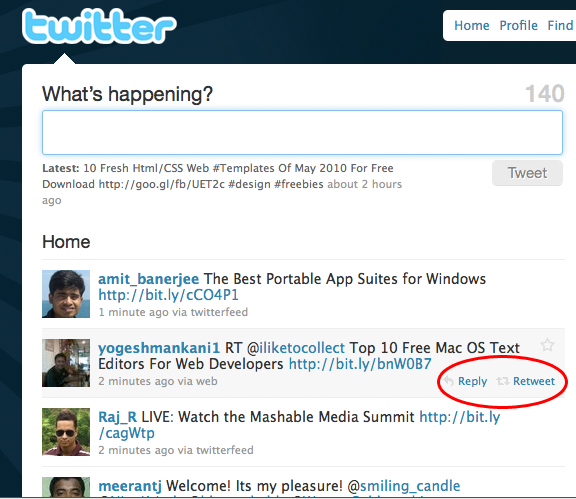
Let’s take an example of Twitter which uses the hover controls very effectively. On the logged in page of Twitter dot com, we see the usual tweets from the people you are following.

In the example above, when you hover on a tweet of your friends you will see that the background changes color plus the Reply & Retweet buttons appears, which are not visible in the normal state.
If those two links have been permanently there before then the user interface must have looked cluttered. But due to Hover controls it looks more accessible.
This can be easily done with a simple CSS.
.edit { display:none; }
.edit:hover { display:block; }
The above CSS snippet can make the required hiding and un-hiding of the links. The hover controls are being widely used in modern web applications and with CSS3 and HTML5 the modern browsers will look more and more robust than ever.
Hover Controls is a fabulous way to make your websites look more user friendly, but one of its downside right now is that, it doesn’t support the mobile platform applications.
In upcoming posts we will cover more techniques to make your web application more user friendly and attractive.
[rss]
Pingback: Making User Interface More Accessible by Hover Controls « Netcrema – creme de la social news via digg + delicious + stumpleupon + reddit
Pingback: === popurls.com === popular today
Pingback: Making User Interface More Accessible by Hover Controls : Popular Links : eConsultant
The downfall here is that the overall usability isn’t better since you’re now on “discovery” mode to see what options are available to you.
Yes the design is less cluttered but this option need’s to be thought out and all different options validated before going ahead with this option.
Another issue is that many people are now accessing websites on touch devices such as the iPhone, iPad, and Android phones which can’t support rollovers in the same way. There’s an article here on why this may mean rethinking hover states on web pages: http://andycroll.com/writing/the-end-of-hover
The hover feature doesn’t work on all browsers I guess. Stupid IE may require a mouseout event hack or so.
This method also suffers from accessibility issues. As Brian pointed out you are now in “Discovery mode”, but how does a blind user with a screen reader or a non mouse user even now the extra links are there? I am not saying these issues can;t be overcome, but it is not as simple as you portray.
I fully agree with Steve Robillard. The term ‘accessible’ in the article main heading is misleading. Hover effects are actually not accessible in the sense of WCAG, if they are the only way to access the information.
The kind of hover effect that shows up controls also relies on user previous aknowledge of the website: novice users may miss those hidden controls.
For web designers, mobile web design is becoming an easy way to acquire new clients. It amazes me how few web design companies are offering this for their clients.
Amiable brief and this enter helped me alot in my college assignement. Say thank you you for your information.