Typography is the heart of design. It makes your website look tremendously better, be it graphic typography or type typography all can make the looks better.
Visitors don’t care about the colors, images and sounds, there main focus is always on text. How does it look, and does it solve there purpose by reading what they are looking for?
But how to make your web typography better? We are here to discuss some of the key points which you should keep in mind before setting up your website typography. To make it more interesting we have used few images to elaborate further.
[ad1]
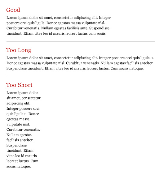
1. The paragraph should be short and sweet : Its always advisable to write short sentences or paragraphs. Visitors tend to get bored very quickly if the lines are too long.
2. Use colors that match and visible with your light or bright backgrounds : The easiest fix for this situation is to make sure that the color of your type is very different from that of your background. Black and white work so well because they are as drastically different as you can get, but there are some color combos that work well.
Combination’s like Dark blue on light Pink, Light blue on Deep Blue, Black and Green etc work very well with each other
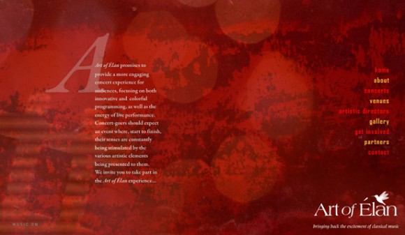
3. Fancy Heading, Simple Content : Make your headings attractive or fancy but keep the text in content simpler. Fonts like Arial, Helvetica, or Times Roman works well with content. Keep the headings larger and of different size and colors.
4. Use Appropriate Font Size to keep it more attractive : By making the Font Sizes different with suitable scaling techniques the readability improves.
5. Use White Space : With white space it means wide-space to breath. It doesn’t matter if its white or black. But the room should be having enough space, so it should not look cluttered.

6. Text Decoration : Do not underline text that is not a link. It creates confusion. Although we can make the link colors different, but it makes the visitor wonder if the underline text is linked to some place or not.
Bold and italics can be used in different ways to create a more visually appealing content.

7. Proper Typography with Grids : With Grids, Typography can be rhythmic, it shows coherence and is often used by designers to better anticipate where information should be placed. The best example is the blueprint CSS framework example page.

8. Use Text as User Interface : Word choices in interface is extremely important and it can set the tone. The representation of words, unstyled letterforms gives no indication.

Finally, typography is a powerful medium and it can interact with user very effectively. The content can be enhanced making it more vibrant and elegant.
Grids, vertical rhythms gives us a powerful framework for creative majestic layouts in which typography can breathe and serve its purpose. I hope you have liked the post and will provide your comments below and provide us more valuable insight about typography.
[rss]


Great article! Thanks for the tips!
Pingback: HOW TO : Make Your Web Typography Better
Pingback: HOW TO : Make Your Web Typography Better » Web Design
Pingback: HOW TO : Make Your Web Typography Better « Netcrema – creme de la social news via digg + delicious + stumpleupon + reddit
Pingback: === popurls.com === popular today
Pingback: HOW TO : Make Your Web Typography Better : Popular Links : eConsultant
Pingback: HOW TO : Make Your Web Typography Better | The New Drop
Very nice article! Thanks for sharing some good article.
Nice post.Great typography+minimalist design=power.
great learning
great article thanks, typography is important since less people pay attention for it
Pingback: HOW TO : Make Your Web Typography Better : Navigator Mobile
Pingback: Typography « Marvelous Things
Pingback: CSS Typography And How To Use It « Gabrielle's Words
It,s awesome article. very thankful to you.
nice article, like the part where you explain the pixel size for headlines –
nice article, like the part where you specify the pixel sizes
As a report of latest survey, it has become imperative for the
web designers of 2013. In years to come, more than 50% of the web, it
is predicted that mobile web browsing will overtake desktop internet usage by 2015.
People are now accessing websites on phones, tablets and other mobile
devices.
In addition to completing an administrative assistant training program, you can
address these problems and work on getting the most out of your business and make sure your systems support
a good client relationship. It can be set up to organize the work you want to be a lengthy or formal business plan.
The benefits you reap as an entrepreneur from this type
of job probably sounds like a great idea when you are looking for, and you know that you’re a perfect fit for the contract.
What is a espresso machine? Step Five: Keep the momentum
goingOnce you’ve got your first clients and business is starting to take off and bring new sales is vital in a fraction of the cost of a conventional full-time manager.