One page websites design is the latest and hot trend on internet now a days. These websites looks more attractive and alive with fresh designs and new technologies such as CSS3, HTML5, jQuery and many more.
Few days ago we has been presented beautiful examples of single page website design for inspiration. Inspiration stuff is always be useful for upcoming designers and brush up their design skill.
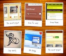
So Today we are going to present some examples of fresh on page website design. I hope designers will appreciate this wonderful work done by designers. feel free to share your views in our comment section.
[re] [rss]
1) Pigspotter

2) Made by Chipmunk

3) Manufacture Dessai

4) Freckles and Handsome

5) I am Jason

6) Weberica

7) Mariuszm

8 ) Attack of the Web

9) Cheap Design Contest

10) Sky Art signition

11) tThe Ultimate bike shop

12) Circuito vilamoura activa

13) Uniq20

14) Dentonjuneteenth

15) Dennys

first one is nice I want some more fresh sits.
Uniq20 is awesome.
I like this one…
http://www.nissanusa.com/microsite/versasedan/?intcmp=2012_versa_sedan.Promo.Homepage.Home.P2
Amazon selection and inspiring. There’s another clean and single page website I came across. Grand Imprint. Cool!
Thanks for putting together this gallery! We did one recently for an event and really enjoyed the process of putting together the flow:
http://secretgardenparty.org
I always love single page websites… simple, clean & to the point.
Pingback: N. » Blog Archive » Weekly Twitter Log (2011/4/30 – 5/12)
Pingback: 59 Web Design Resources Tweeted at @htmlcut - PSD to HTML Blog
Hello,
I really love the third one (Manufacture Dessai) The picture is really beautiful, and the full screen approach defenitly conviced me (even if from a performance perspective, i am still not sure this is a good strategy).
PS: it is kind of fun to see the healthy run sponsorised by Mc Donalds :p
Great blog the days of over the information portal type of sites are long gone. L resse and jack trout leading marketers were talking about this idea 15 years ago where one gives the prospect a few simple options for choice and keep things simple and tight. These designs are all fantastic and are visually grabbing i like the Freckles and Handsome sites becuase its clear concise and leaves the user with simple and effective choices.